Timber, completed. #10 in the Spring Portrait Marathon

Timber (borzoi) 8
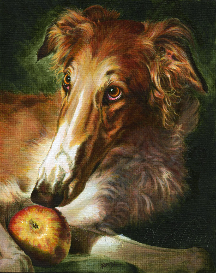
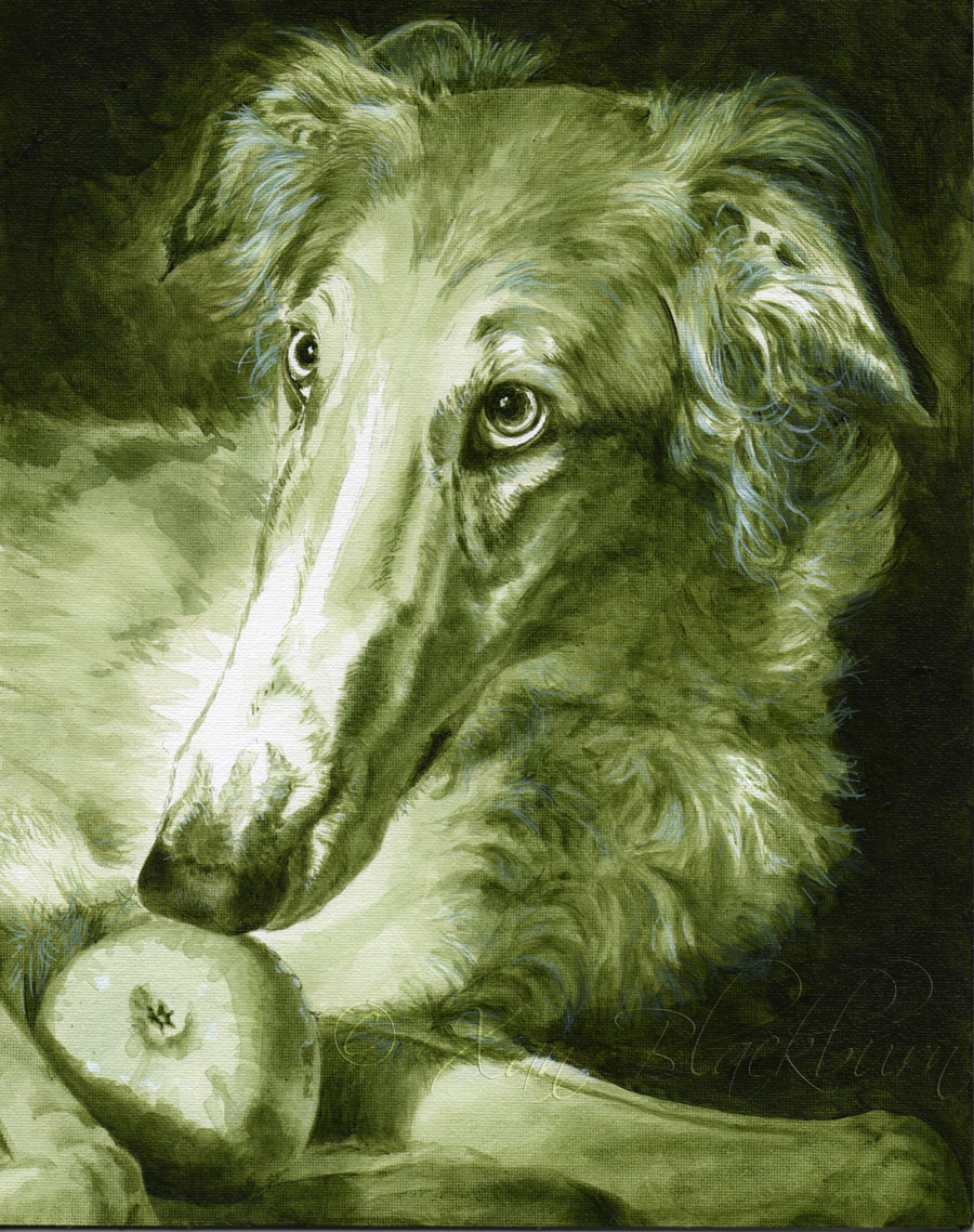
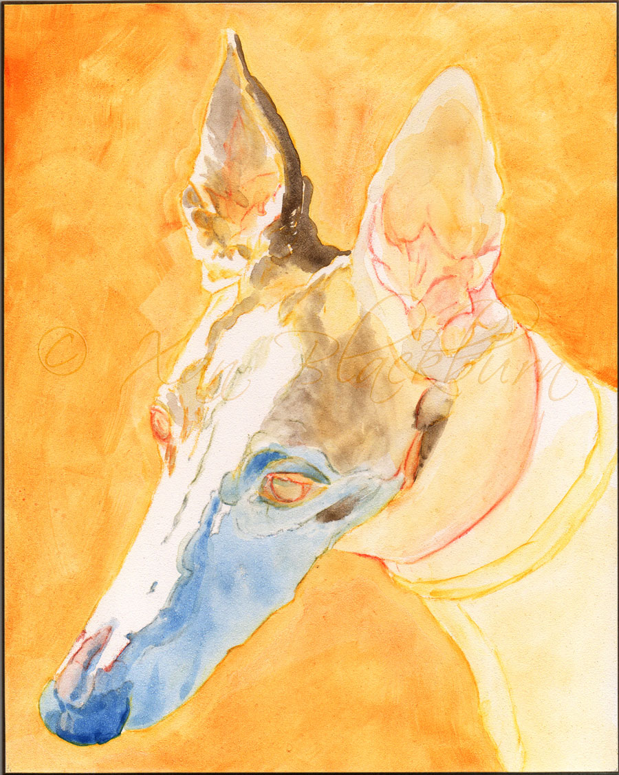
Timber (borzoi)
8″ x 10″ acrylic on canvas panel
© Xan Blackburn 2014

Continue reading Timber, completed. #10 in the Spring Portrait Marathon

Timber in progress: #10 in the Portrait Marathon

  • Timber (work in progress, 1)
  • Timber (work in progress, 2)
  • Timber (work in progress, 3)
  • Timber (work in progress, 4)
  • Timber (work in progress, 5)
  • Timber (work in progress, 6)
  • Timber (work in progress, 7)

Continue reading Timber in progress: #10 in the Portrait Marathon

Cole (greyhound), #9 in the 2014 Portrait Marathon

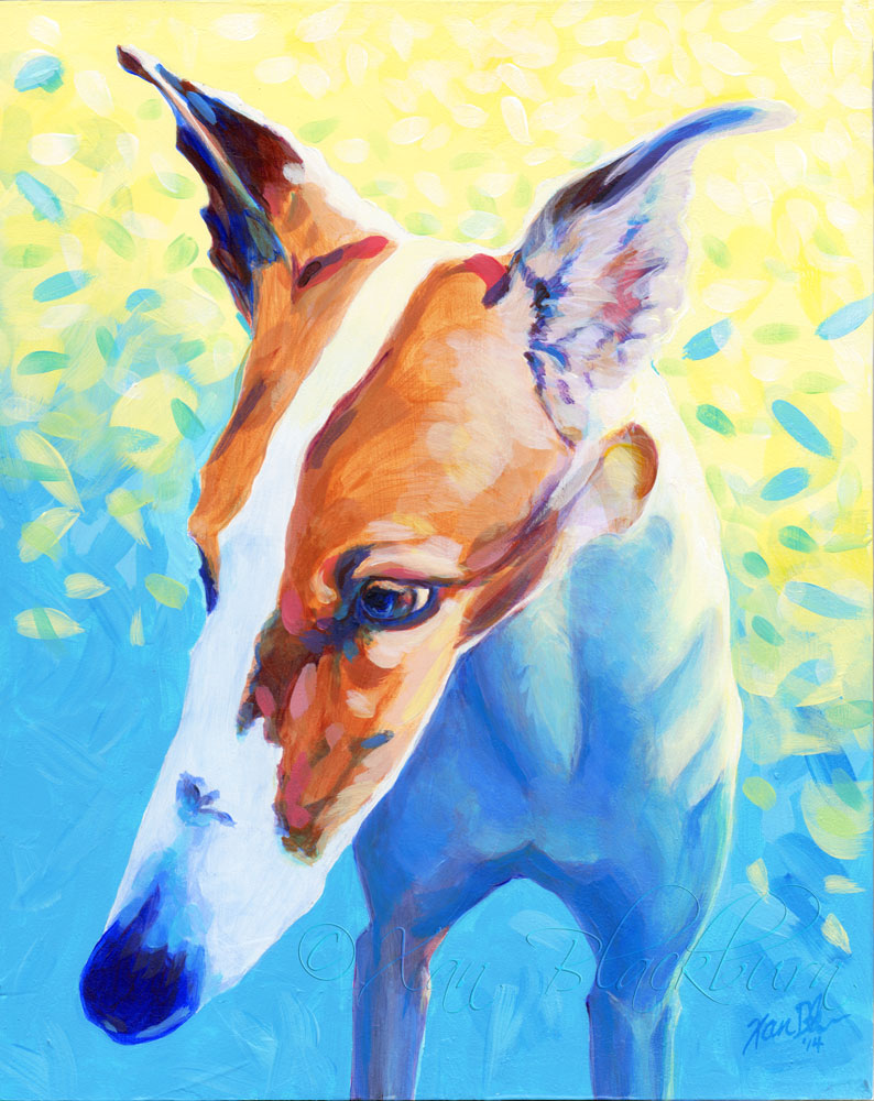
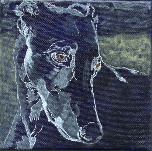
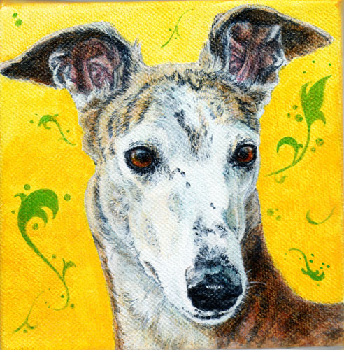
“Cole”

(greyhound) 8″ x 10″ acrylic on panel, © Xan Blackburn

Continue reading Cole (greyhound), #9 in the 2014 Portrait Marathon

Sasha the Samoyed; #8 in the Portrait Marathon

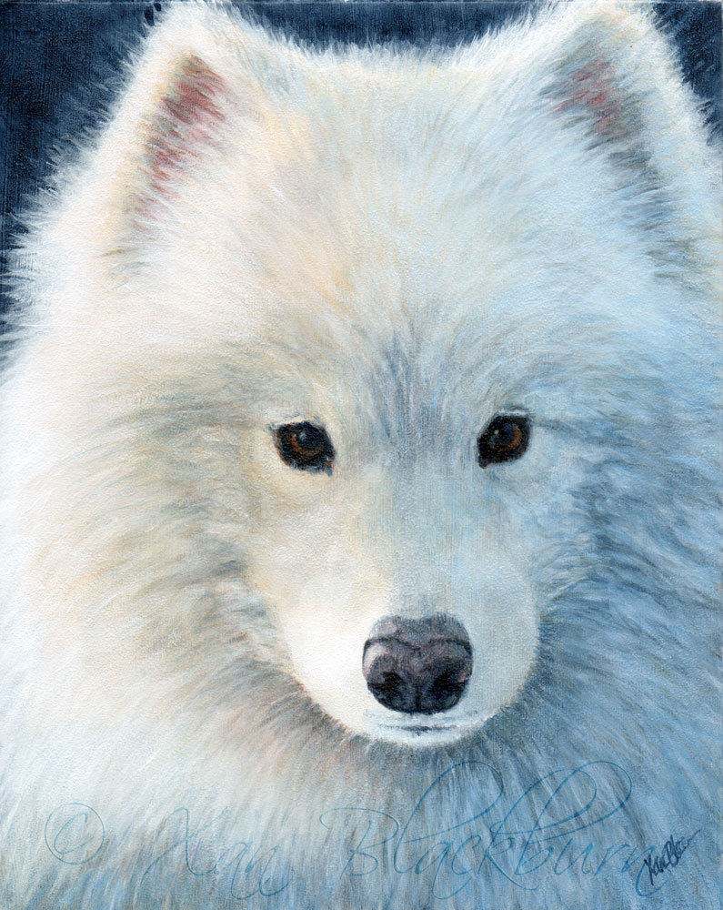
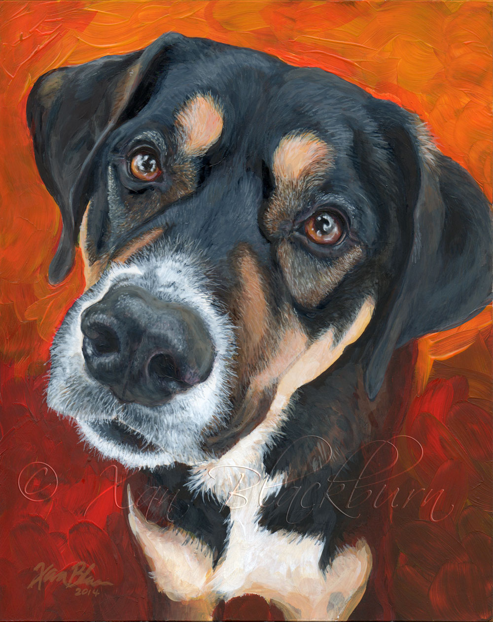
“Sasha” 8″ x 10″, acrylic on Claybord, © Xan Blackburn

Continue reading Sasha the Samoyed; #8 in the Portrait Marathon

Sushi, #6 in the Portrait Marathon

"Sushi" 8" x 10" acrylic on Claybord, © Xan Blackburn

Sushi!  Isn't sushi supposed to be something created quickly, from fresh ingredients, beautifully presented?  Well, Sushi's portrait took me a whole week, but, I hope she presents well anyway.  I'm pleased!

Sushi is a breed mixed to perfection for her active family.  They take her on training runs for their marathons, to the dog park to play with her buddies, walks twice a day, and she still has a basket full of toys and the energy to play with them!  Sushi's "grandma" commissioned this portrait for her daughter.  I love being part of a gift like this!

But, why would such a lovely, happy girl give me such trouble?  Well, it wasn't her fault, I assure you!  She is inspiring!  Maybe that was the problem.  My muse has taken it into her squirrely head to change directions on my mid-marathon!  Yeesh.  Nice timing.  My natural tendency for the last several years has been fairly detailed, fairly realistic paintings usually done in a very traditional method of underpainting and glazing.  So Muse decides it's time to switch that up, and won't let me work that way!  She is very taken with the bolder, more impressionistic mode I took in a few recent paintings (Puff, and Sadie).  Okay, but I feel torn, because I think people are expecting me to be my old, detaily, traditional self.  So, I got stuck.  Here's how it went.

Sushi, drawing transferred to panel
Fixing the drawing with a warm gold tone
Sushi: work in progress #2
Fixing the drawing with a warm gold tone
Beginning an underpainting ...
Sushi, work in progress #3
Beginning an underpainting ...
Sushi, work in progress #4
I've gessoed over the painting to get a better surface and a fresher start
Sushi - digital sketch
Sushi, work in progress #5
Beginning to block in basic colors and values
Sushi, work in progress #6
Sushi, work in progress #7

Sushi Reference Photo

Here's my reference image.  What a cutie, eh?

Starting out like usual, I fiddled with the reference photo, cropping and deciding what to do with the background, getting my drawing the way I wanted it, then transferred the drawing to the panel using vine charcoal.  

 Next (on the left), I started to sort of dab at the drawing with a warm gold that I thought I'd end up doing the underpainting with, or at least some of it.  Or the background ... I was starting to lose touch already.  This type of panel (Claybord) is very smooth, and very absorbent.  That presents its own issues.  If you paint thin and wet, as I tend to do in my underpaintings, each stroke gets sucked into the board, leaving the edges of the stroke apparent, and temporarily darkening, like wet paper, which is confusing to work with, and hard to overcome with more translucent layers, all showing each brush stroke.  But I kept trying, laying in an undercoat for the envisioned background, as you see in the third photo on the left.

I went to the next step; starting to lay in some of the dark tones of her black fur.  I was really getting frustrated with the effect of the strokes on the Claybord, and finally realized that I was not going to achieve what I wanted on that finish.  I needed to seal the clay with a layer of gesso, so the paint would sit on top the way I wanted it to.  So, I used a foam roller, and rolled on a thin layer of gesso.  You can still see the underpainting beneath the gesso, in the fourth image on the left.

Frustrated and stymied, feeling this pull towards the more painterly style I'd been having such fun with, I went back to my computer, to experiment with ArtRage 4 (a painting program I've been enjoying for years now).  Letting it all just flow, I came up with a really loose painting that brought me back to the inspired feeling I'd had when I first looked at Sushi's photos.  (See the 5th image on the left.)

Ah!  Okay, so now I needed to bring that back to the panel, and let loose there.  No translucent layers: just dive in with a thickly loaded brush and paint what I see!

Sounds good, right?  This is the next fight I had with my muse.  Muse says, "Feel the abandon of the free-range artist!"  Cautious self says, "My clients expect something different from me!  They want what they expect.  That's what they are paying me for!"  *sigh*  A couple days go by, stuff is happening, but it's not painting.  A bit, but not much.  (See image #5 image on the left.)

But then I just decide to let the muse take over for a bit.  It can't be worse than standing still.  This is a marathon, for pete's sake!  So, I jammed along, and got to an enjoyable place by the last image you see on the left.  I had the idea that I knew how to resolve the battle.

Friday morning, I knew what to do.  I had found that I could approach this similar to how I had used gouache paint.  In essence, lay in the larger areas of general color and value, then work on top of that to layer in the detail.  It is a combination of the painterly style, in effect using it as the underpainting, and the glazing techniques to achieve the detail and final unification of the portrait.  With gouache, which is water-based, the layers can be blended, or melted into each other to whatever extent you want, or laid on top opaquely.  With acrylic, you can't blend into previously dry layers, but you can paint translucently, which helps to blend the layers visually.  Here's a detail to show a little more what's going on.


"Sushi" - detail
"Sushi" - detail
Notice both the bold strokes, and the fine laid on top to define details and focus

So, now I have a game plan.  I really loved painting like this.  It marries both my desire for a passionate approach to the paint and subject with my need to refine the painting to reflect what I see more closely.  I doubt it's a stopping place.  Being an artist is like life - you just keep growing and changing, whether you mean to or not.  Still, it gives me a real confident way to splurge on the paintings I have yet to do in the marathon.  I'm all charged up now!  

Tomorrow, I begin Samara's parents' dachshund, Scooby.

PM – Luki (greyhound portrait)

Luki-P001
Luki - work in progress 8" x 10", acrylic and conte crayon on panel © Xan Blackburn

I'm pleased with this stage, though I had hoped to be a bit further along by quitting time tonight.  Well, life, in all it's variability, will make hash of the best of plans, eh?  

Here's a quick run-through of how we got here.

Luki - reference original

Luki is a delicate thing, a bit shy, a little un-sure.  Of the reference photos, I had to choose this one, for the lovely lighting, her alert gaze, pricked ears, slender muzzle and cautious mouth. 

Luki - reference photoshopped

 As usual, I took it into Photoshop, and experimented with the background, composition, lighting, etc., until I was content.

Cleaning Pallet

Once I got my pallet cleaned up (so cathartic!) after Sadie's portrait ...

TableReady

my painting area all set up ...

Studio dogs - Check!

and my studio companions in their places ...

I began.  First, I transferred the drawing I had refined in photoshop by re-drawing on the back of the printed paper with conte crayons (dry pastels).  I chose to use different colors for this, as this method does leave definite traces in the painting, and I wanted to enhance the painting, not create something I'd have to fight with later.  Cool gray for the muzzle areas, and a hot yellow-orange for the rest.  Taped it to the panel, and drew over it again to transfer the drawing to the panel.  I set the drawing using a brush wet with a bit of dilute acrylic polymer, letting the color of the pastels act like paint as it spread into the acrylic.

I was on the fence about how to go forward: bold, like in Sadie's portrait, or more cautiously, in glazes, as I generally do?  Like Luki, I decided on the more cautious approach to suit her personality.  What with one thing and another, this is as far as I got today, and I'm pretty pleased with the feel.  

Tomorrow: more Luki!  I have a feeling these are going to average 2 days/painting.  Let's see if I'm right!

Portrait Marathon: Finale, stage two. Strider

I think I’m done.  I know!  I know!  I say that, and then the next day, I fiddle around some more, and THEN I’m done.  So, maybe I should just post this as an update.  The penultimate Spring Portrait Marathon post.

Well, let’s back up, and I’ll tell you more about how I got to maybe-I’m-done v.1.

In my last post, I hadn’t really gotten very far along in the actual painting.

My next stage looked like this.  The white drawing was proving to be very durable (good), but hard to paint out (bad), but I was pretty sure I could work that out with enough time and paint.  Here, I’ve gotten a pretty good handle on my darks and lights, and laid in the basic color zones I’ll be working up from.  I really enjoyed how his brindle stripes looked on the dark blue background.

At this stage, I’ve come a long way, with bazillions of little hair strokes, in layers, throughout.  The grass and sky background are just suggested, which I thought might stay like that.

I needed to up my contrast, and control the shadowy plane on top of his head a bit more, but this was definitely getting into the final round.

Which brings us to the present.  With a few bazillion more hair strokes, refining the details throughout, and a little bit of adjusting of the background colors, I’m pretty pleased with this result.  Handsome Strider, gazing off to our right, seems to be enjoying a lazy spring or summer day.  Makes me want to lie down in the grass with him, and just watch the clouds go by!

So, am I done?  Tomorrow will tell!

My next project beckons, too!  I’ll tell you more about that in my next post.