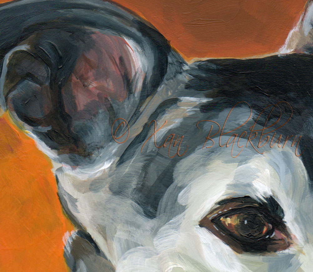
“Sushi” 8″ x 10″ acrylic on Claybord, © Xan Blackburn Sushi! Isn’t sushi supposed to be something created quickly, from fresh ingredients, beautifully presented? Well, Sushi’s portrait took me a whole week, but, I hope she presents well anyway. I’m pleased! Sushi is a breed mixed to perfection for her active family. They take her on … Read More “Sushi, #6 in the Portrait Marathon”
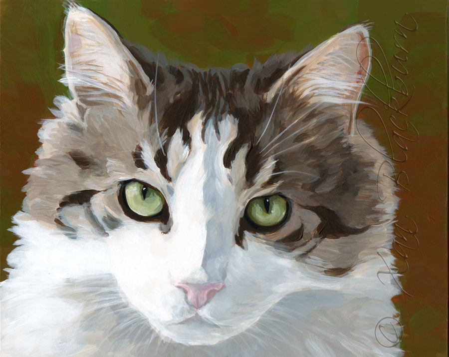
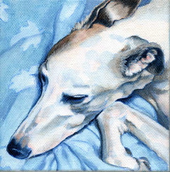
Puff10″ x 8″Acrylic on Claybord panel© Xan Blackburn Eponymous Puff looks quite … stern. Laura says he was a fearless guy, despite the fluffy fur and name, who taught many the greyhound just what cats are all about. Lived to a grand age of 19 1/2, too! Puff’s portrait was based on a photo … Read More “#5 in my Portrait Marathon: Puff the kitteh”
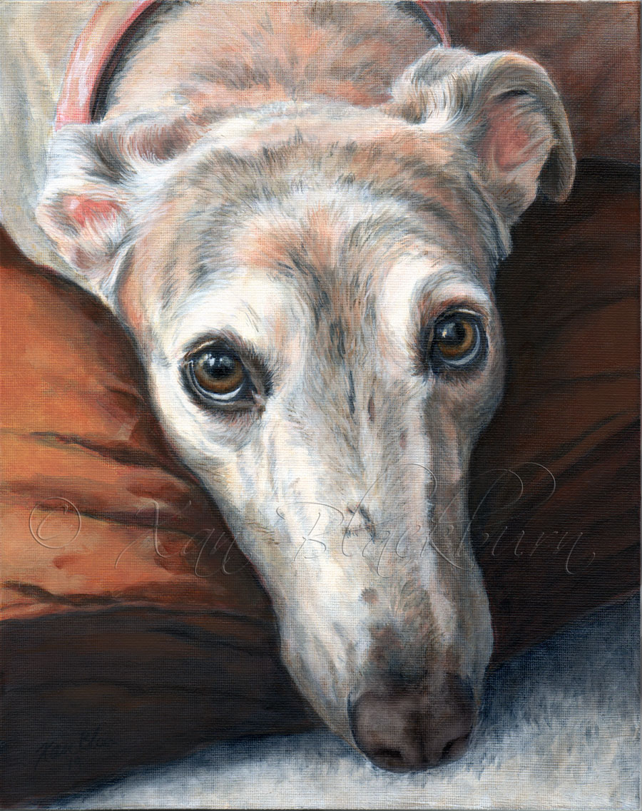
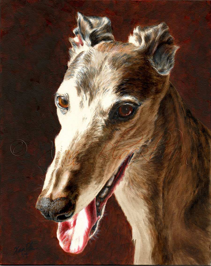
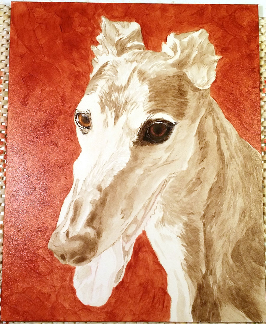
“Cash”8” x 10″acrylic on canvas panel© Xan Blackburn Chris’ greyhound, Cash, at age 10, is on her second life! That’s pretty good for a spooky grey, I’d say! She had a bad reaction to routine shots, actually died, but was brought back to life – a modern-day miracle! And, a gorgeous, blue-brindle gal, to boot. … Read More “#4: Cash’s Portrait”
I’m pretty sure Red’s portrait is done. I’ll sleep on it (not literally – that would not be comfortable at all!) Since it’s almost 9:30 at night, and tomorrow is Chris’ greyhound, Cash’s turn at the Marathon, I’ll just give you a gallery of progress pictures to look at.
Stellaacrylic on Aquabord8″ x 10″© Xan Blackburn I think I’m done with Stella. I hope Lynn agrees! As it’s Memorial Day weekend Saturday, my husband and dogs are all wanting dinner, and I’m rather hungry myself, I’ll just show you some progress pics to show you how I got to this point. Enjoy! Warning: Array … Read More “PM #2: Stella – done!”
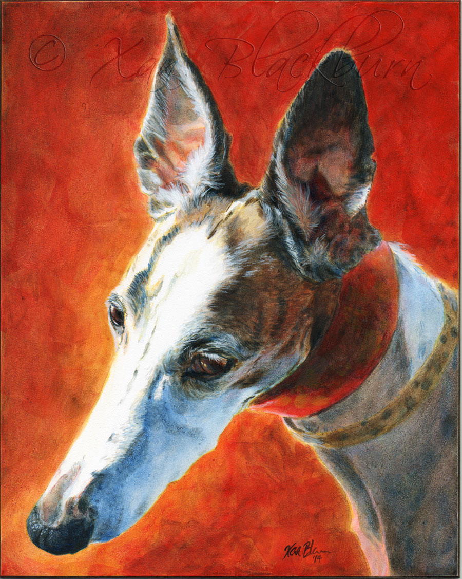
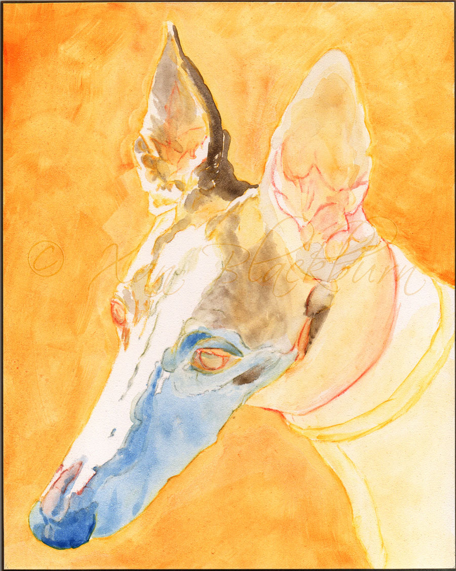
Stella – work in progress, stage 3acrylic on Aquabord8″ x 10″© Xan Blackburn Stella, the sleeping beauty! Okay, she’s not sleeping in this portrait, but her owner tells me that she sleeps a lot, and sent me several photos of her in that state. Sounds like a greyhound to me! (Contrary to popular belief, greyhounds … Read More “Stella, the Sleeping Beauty”
Luki acrylic on panel, 8″ x 10″ © Xan Blackburn Delicate Luki! I really enjoyed building up these hot and cool layers to create this pup’s portrait. It feels like that may capture her personality, in a way, maybe echoing her own internal contrasts. I only took a couple pictures besides the final scan … Read More “PM – Luki’s portrait complete”
Luki – work in progress 8″ x 10″, acrylic and conte crayon on panel © Xan Blackburn I’m pleased with this stage, though I had hoped to be a bit further along by quitting time tonight. Well, life, in all it’s variability, will make hash of the best of plans, eh? Here’s a quick … Read More “PM – Luki (greyhound portrait)”
Wow. Well, once I got rolling, this just went like a flash! Isn’t it funny, ha ha, that the painting part of this portrait actually went quickly, but all the hair-pulling, sketching, sighing and laying in bed at night imagining the painting took days! I should be used to that, but there ya go. I … Read More “Surprising Sadie, Done”
You know what that means, right?A flat-out painting dash, where I throw caution to the winds, take on all comers, and paint your portraits one right after the other ’til I run out of canvasses. Or, in this case, a baker’s dozen of 8″ x 10″ panels. (For a bit more in-depth info on how that … Read More “Portrait Marathon Date Set: May 20”