How to go from a gorgeous photo to a painting worth the effort?
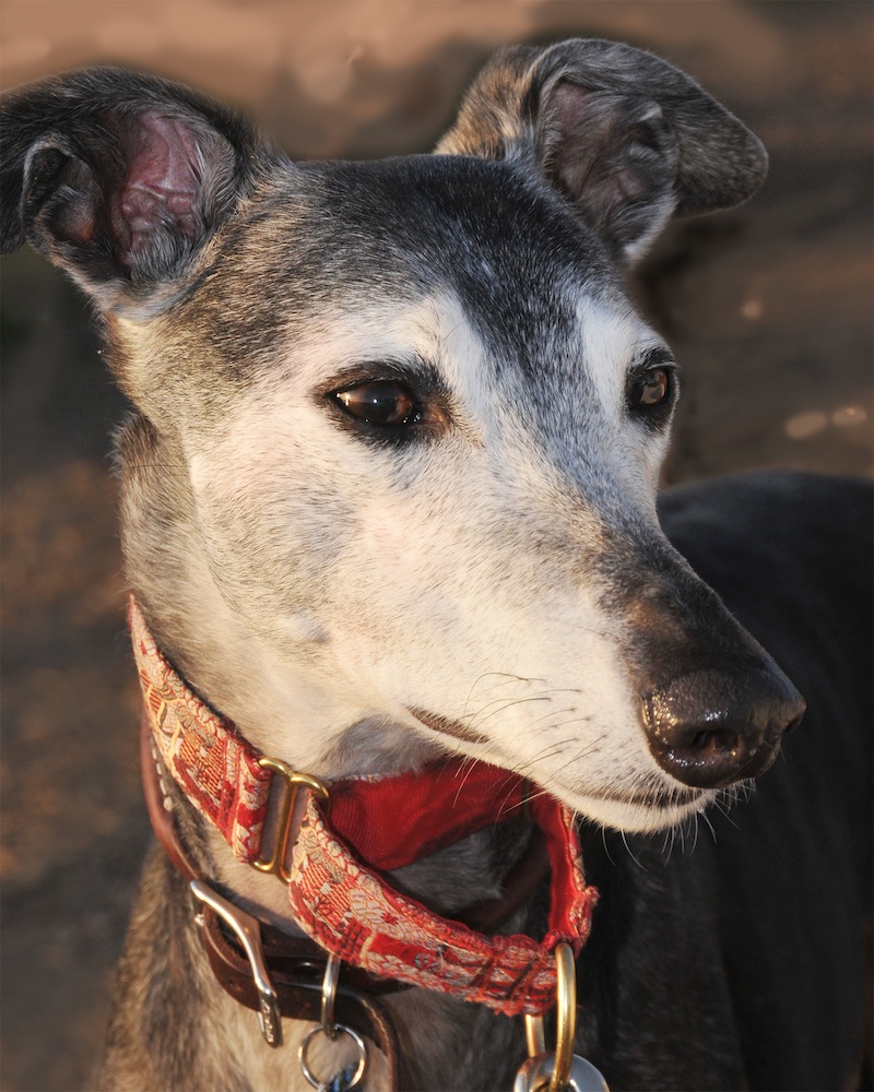
When I (oh, so rarely!) get a reference photo as nice as this, I’m stuck with an odd quandary.
Usually, the challenge is how to take a vague series (if I’m lucky) of photos and seek out the truth, the soul of the subject/s, and transfer that to the painting in a way that offers an emotional reality. For me, that generally seems to happen with lots of detail, as I seek out the small features that define the subject as a whole.
In the rare case where the photo is already a portrait, a work of art in its own right, what to do? Reproduce all the detail already in the photo? What’s the point of that? I’m in the weird and liberating position to actually remove detail in order to create the emotional reality.
But, it took me awhile to figure that out. I started Sadie’s portrait as I usually do. Take the best reference photo into Photoshop to work out some questions of composition, light direction and color balance, optimize the tonal (light/dark) variation for best effect, and get an idea for the background I’ll be using. Once that’s ready, I transfer the drawing to the surface, and start with an underpainting.
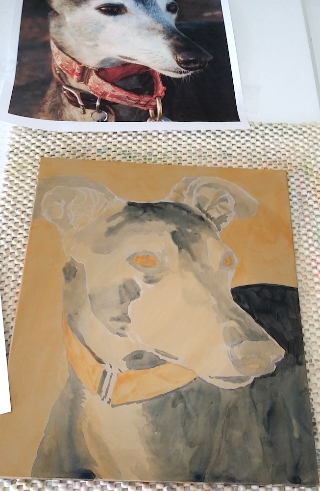
Using just darks on a light background, and adding the layers of color and highlight only once the tones are set, the process is like coloring a black and white photograph with transparent colors. That’s where I was headed with Sadie’s portrait. Just like usual. And, yaa-aawn. I just wasn’t feeling it.
Feeling frustrated, and concerned that her dark back would make me lose her dark nose, I took the reference photo back to the computer, this time opening it with ArtRage, which is a painting program.
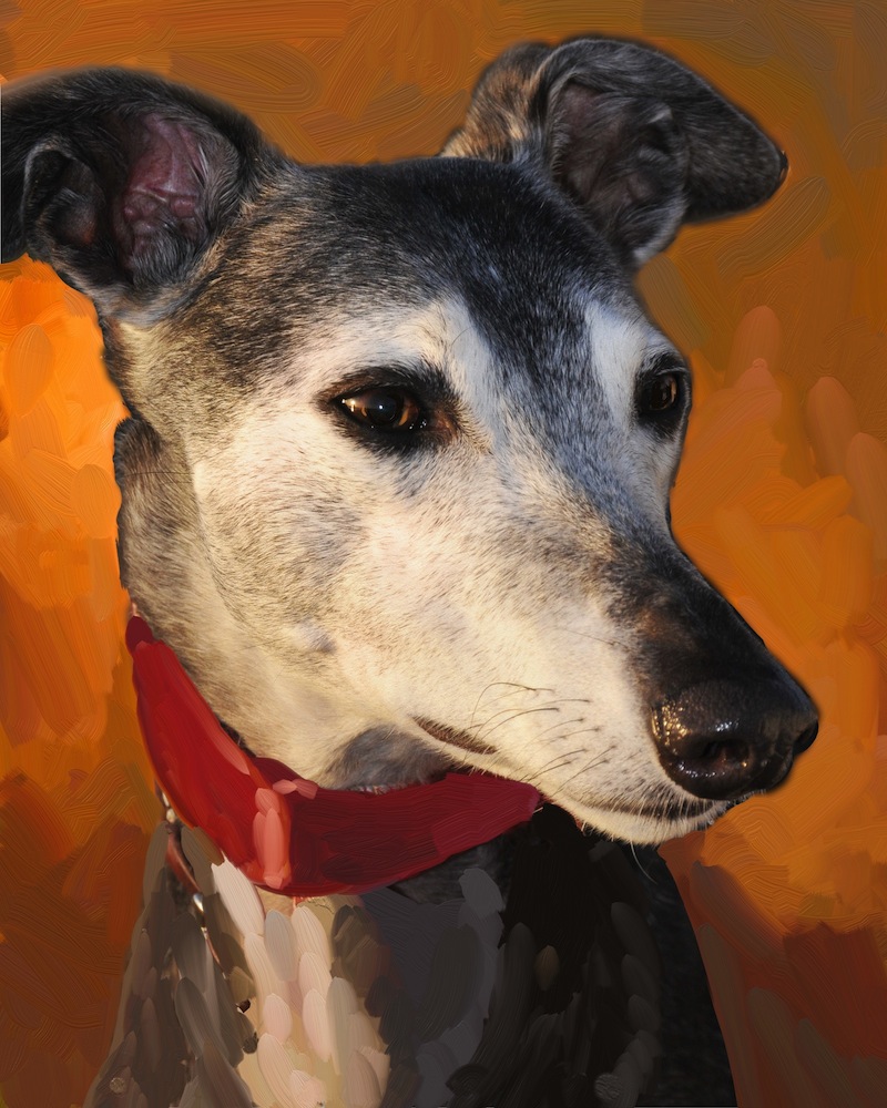
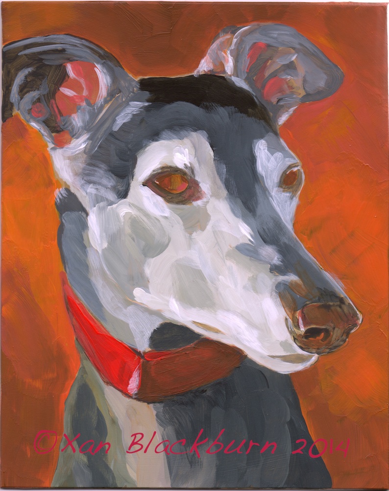
I painted out some of her collar, which I felt was too distracting, and her back, reducing her to her head, neck and upper shoulders. Better. Excited by a bit of magic that happened with Roheen’s portrait, I tried using Sadie’s eye color in the background. Oh! Now that’s better. That’s exciting. Back to real paint.
To cover up her dark back where it was already painted on the panel, I needed to go thick and opaque. I mixed up a range of colors, grabbed a 1″ wide brush, and dove in. With acrylic, you have to work quickly if you’re trying to blend, before the paint dries to a sticky glue or an impervious film.
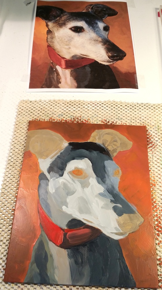
Now, that’s exciting (read: scary) for me. (I may have mentioned a few times in my blog that I am cautious and timid a lot!) Yee-haw. I’m also cheap, and there was leftover paint on the pallet that would dry soon, so I picked up a slightly smaller brush, and dove into Sadie herself. Such wild abandon! I was getting an attack of the scared-to-deaths about her busy and important nose and ears, but after a bout of quivering, grabbed my brush back up and laid back into these details. I had to stop there for the evening, but kept sneaking back to look, and feel the surprise of seeing this type of painting on MY table.
Okay, we’re up to date (and my blog ate the first version of this post, so I’ve spent way too much time on all this for the day). Back to actual painting! To be continued.
2 Responses
I think she’s looking fantastic!
Thanks! Really different for me, isn’t it? I know I didn’t invent the style 😉 but it’s new on MY easel. 😀