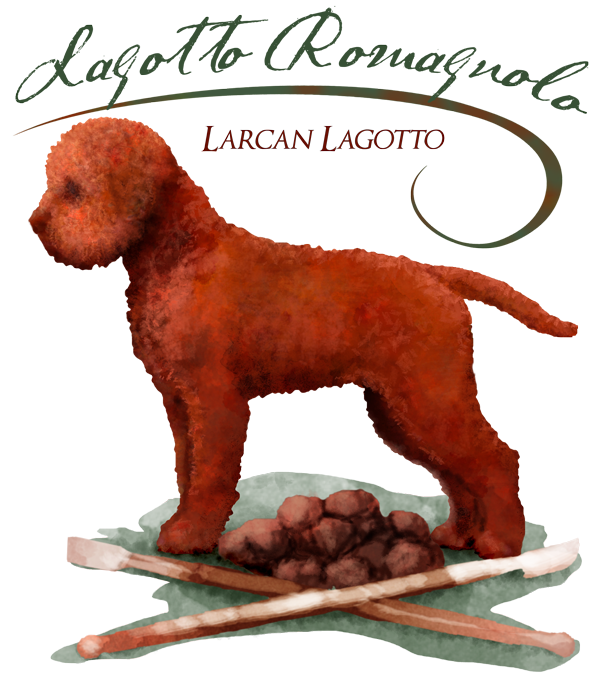
Back when the wheels all flew off my life, I had a couple art jobs hanging around my studio. One is a gift I can’t reveal just yet, except to say someone is getting a greyhound portrait. (Just now remembered I can’t post any pictures of that, yet!) The other is an illustration of a Lagotto Romagnolo, one of a few I’ve done for this client. She has been so kind and patient to wait me out, and now I’m finally wrapping it up for her.
I met Lisa with one of her handsome little dogs at a dog show in California. I’d never even heard of these Italian truffle-hunters before, and was enchanted. With soft, poodle-like fur, a sturdy medium-sized body, and friendly personality, Logottos are quite the charmers!
The concept was to include a pile of truffles,

a couple truffle hunting tools,

the dog, and to be done in a watercolor or color-pencil type feel. The illustration was created using Photoshop, using a bunch of different watercolor-style brushes, as well as other tools. As with traditional media (brushes and paints), the final effect is best built up in layer after layer of translucent color, to add and complement the colors under and around each mark. It’s fun to play with the various brush effects! It’s not watercolor; it’s definitely a hybrid of digital and watercolor-like techniques. The sum of its parts.
She talked me through the important conformation points, and this is what we came up with.
With this illustration done, I guess that means … those who are signed up for my newsletter are about to get a shot at my Commission List!
]]>
I actually have several graphics I’ve gotten wrapped up and haven’t told you about along the way, and have a portrait of one of my favorite dogs EVER on my table at the moment. Sadly, it’s a memorial portrait, which I still cannot believe. *sigh* Truman was one of the few of my portrait clients that I’ve actually had the honor and joy to know in person.
Let’s start with the graphics and illustrations, shall we?
After completing two logos for Brian Southwick (the his real estate logo here, and this real estate development logo here), Brian’s wife got in touch with me to work up a logo for her. Also a real estate agent – broker, actually – she wanted something to reflect her own interests in gardening as well as to give a sense of the sophisticated homes she sells, with colors that would work with the identity colors of the company she works for. We kept this very clean and the symbology clear.
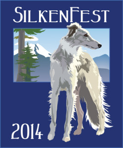 |
| SilkenFest 2014 (primary logo) ©Xan Blackburn 2014 |
I have had a lot of fun working with Iola and Penny on this next one. An earlier project they were involved with resulted in some graphics that ended up on the cutting room floor, but which had a lot of support. We recycled part of that un-used imagery to create a logo for the 2014 SilkenFest; the big annual event for fanciers of the Silken Windhound. This one has three versions, so far, which can be used in various settings, including a backdrop for photographs of the winners of the various events.
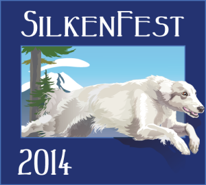 |
| SilkenFest 2014 (variant) ©Xan Blackburn 2014 |
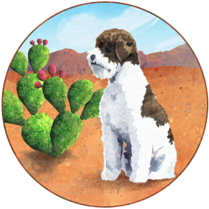
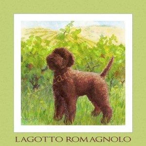
Awhile back, we took a jaunt down to California and stopped in at a tiny dog show in the Sierra foothills. I met a woman who was showing her Lagotto Romagnolos, a breed I’d never run across before. We got to talking, I gave her my card, and we’ve worked on three projects so far. The first was a logo for the Lagotto Club of America, which I talked about here. These two are for the Lagotto club specialty; one for the specialty logo, and the other for a custom wine label. I really enjoyed building up a watercolory effect with these two. I tried doing actual watercolors for the wine label, but the learning curve was too steep to get the effects I wanted with the editability we need for logos, so back to Photoshop we went!
 |
| Lagotto Specialty Logo ©Xan Blackburn 2014 |
 |
| Larcan Lagotto Wine label ©Xan Blackburn 2014 |
 |
| Starfyre Silken Windhound Kennel Logo ©Xan Blackburn 2014 |
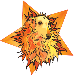
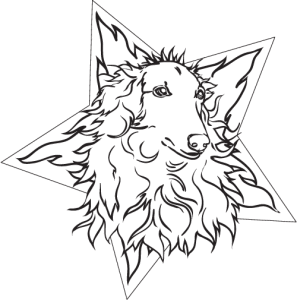
This one was fun! (I have such nice clients!!) Working from a photo of one of my client’s gorgeous hounds, we played with the wonderful silky fur, and the kennel name (Starfyre), for this treatment. They thought they might even want a black line version as a tattoo (now that’s a lot of like!), so we also have this version.
 |
| Starfyre Logo/tattoo design ©Xan Blackburn 2014 |
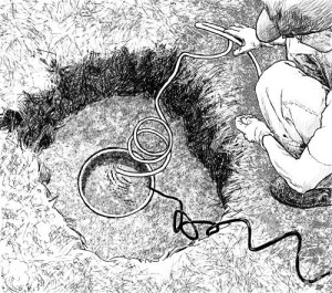 |
| Illustration for water field guide ©Xan Blackburn 2014 |
Work continues on my husband’s field guide for water use. I mentioned the cover design here. It’s been enjoyable doing this pen and ink-style drawing. I’m doing the drawings digitally, but they still feel very old-school to me.
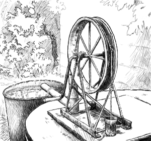 |
| Illustration for water field guide ©Xan Blackburn 2014 |
Now, on to Truman’s Portrait
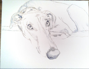 |
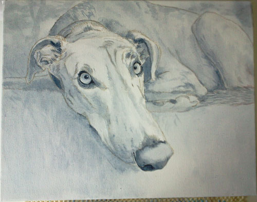
| Truman – work in progress ©Xan Blackburn 2014 |
Truman was a big, beautiful greyhound, a blue brindle, which is a coloring that never fails to just make my heart go pitter-pat. Besides being a knock out physically, he was a knock out personality, too. Huge. This portrait captures an especially quiet moment, I expect after so much throwing himself around that he was exhausted. Lying in the grass in the cool shade of summery trees, I want to focus in on his pale amber eyes, that resting-but-ready attentiveness, and of course the classically long greyhound schnozzle.
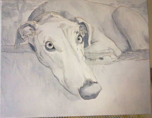 |
| Truman – work in progress ©Xan Blackburn 2014 |
 |
| Truman – work in progress ©Xan Blackburn 2014 |
So, that’s where I’m at as of today. Always plenty to do, right?
The idea got tossed out that I might do a graphic novel/comic book using sighthounds …
(and other breeds, probably) as the characters, maybe some super-hero action, maybe serialized, maybe digital and/or print-on-demand …. Anyone have any thoughts on that? Would you actually buy something like that? What kind of story-line would be more compelling, to you? I’d love to hear from you! Drop me a comment!
 |
| Belling Hamster © Xan Blackburn 2012 |
That’s pretty graphic, wouldn’t you say? Well, it’s a graphic, anyway.
Projects all have gaps in them, some longer than others, so I like to keep a few going at a time. Keeps me fresh and working if I hit a block wall in one area, too. As fate would have it, and despite my intention to concentrate on portraits, graphics work has really been the theme for the last few weeks.
The Belling Hamster was drawn for an awareness campaign in Bellingham, WA, letting folks know that plastic bags are now banned in that city. (The unofficial citizen nick-name is Bellinghamster, you see.)
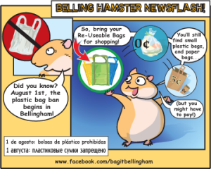 |
| Plastic Bag Ban, Bellingham infographic © Xan Blackburn 2012 |
 |
| Real Estate Logo by Xan Blackburn, © Brian Southwick 2012 |
Just as the Heronswood logo was wrapping up, I got an email from a realtor who is partnering with my friend and client from the Heronswood project, asking about a logo for himself. He had a concept of a guy on a unicycle, with his name, and maybe the motto. He even sent a picture of himself on a unicycle! Loved that. Guy in a suit, with a golf club in one hand, and a briefcase in the other, at a rakish tilt, on a unicycle! After a bit of backing and forthing, including the first sketch being a total flop, prompting him to give up his idea altogether, we worked up to this version, which we’re all happy with. It was a lesson in communication, really. He didn’t like my first take, and I had to talk him back towards getting his heart’s desire rather than scrap the idea. Graphics are invariably a process, a collaboration between the client and the artist. Well, I guess that’s true with the portraits, too.
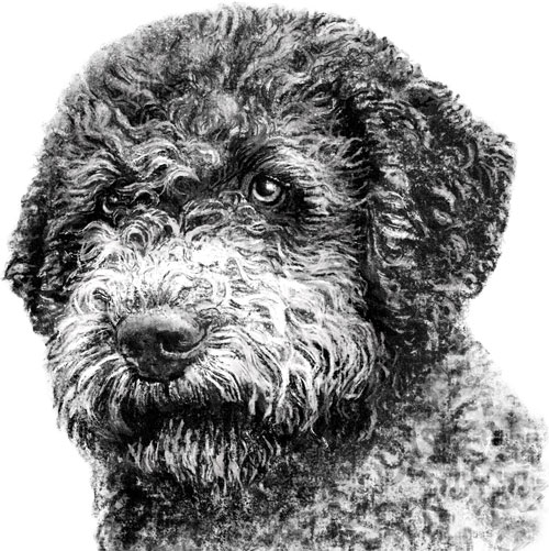 |
| Lagotto Romagnolo Club of America Logo: dog head © LRCA 2012, by Xan Blackburn |
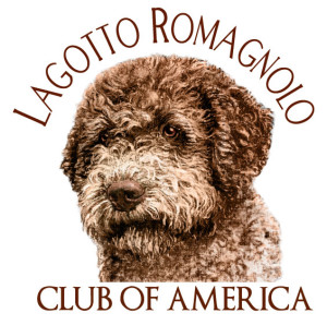 |
| Lagotto Romagnolo Club of America Logo: arched © LRCA 2012, by Xan Blackburn |
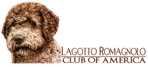 |
| Lagotto Romagnolo Club of America Logo: horizontal © LRCA 2012, by Xan Blackburn |
