")
")
")
")
")
")
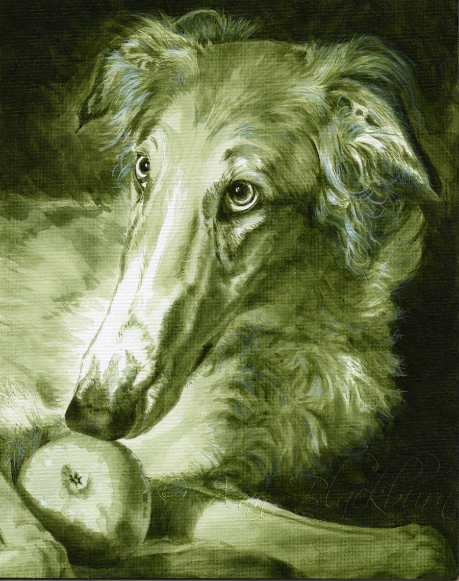
Timber’s reference photos were so good, and he’s such a gorgeous subject, with those baroque copper and gold curls, in that Renaissance lighting and pose, that my response was to research Rembrandt’s painting techniques. One interesting bit I gleaned from that quick survey was that in France, the painters of that period used green as an underpainting for their portraits, feeling that it would give a lifelike feel to the shadows beneath the warm skin tones of their human subjects. That intrigued me, as I have most often used a cool dark gray for my underpaintings. Red and green are opposites on the color wheel, and mixing them gives you gray, so the idea that laying down green, then glazing over it with red would give me anything different than that gray is both terrifying and pretty darn interesting. So, I thought I’d give it a whirl. If I screw it up after all this, I’ll be disappointed, but hey, live and learn! (Don’t worry, Terri! I’ll fix it if I mess it up!)
Latest Comments
All content Copyright 2023 Xan Blackburn
2 Responses
That picture of Timber is still one of my favorites! I can’t wait to see the finished product!
[…] ← Previous […]