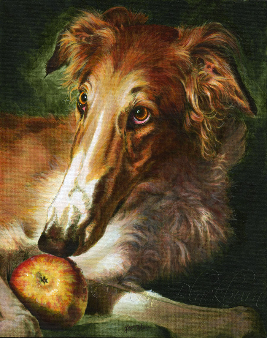
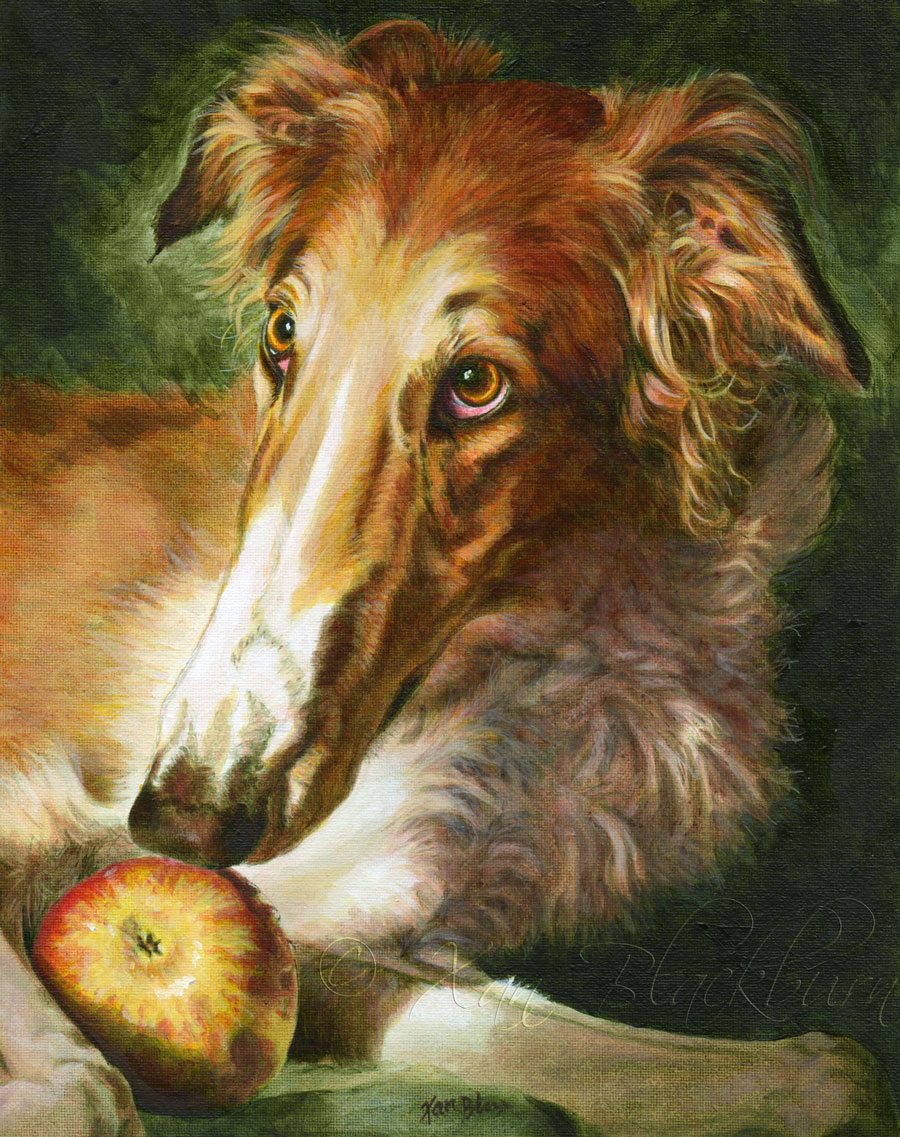
Timber (borzoi)
8″ x 10″ acrylic on canvas panel
© Xan Blackburn 2014
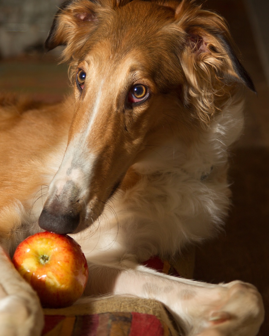
Timber’s portrait took longer than some, but I’m not sorry! Faced with such a stunning dog, and Renaissance-style reference (at right, by owner/photographer extraordinaire Terri Jacobson), what was I to do?
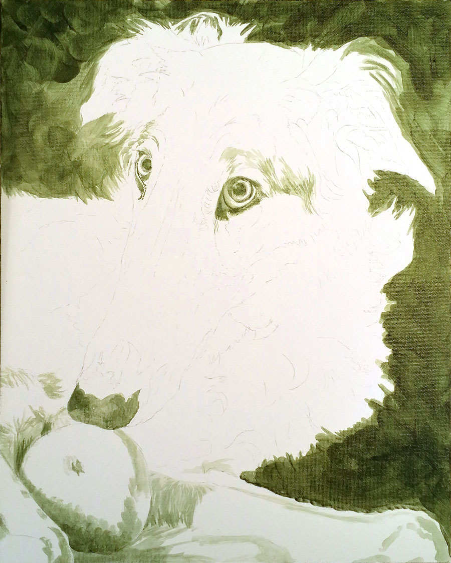
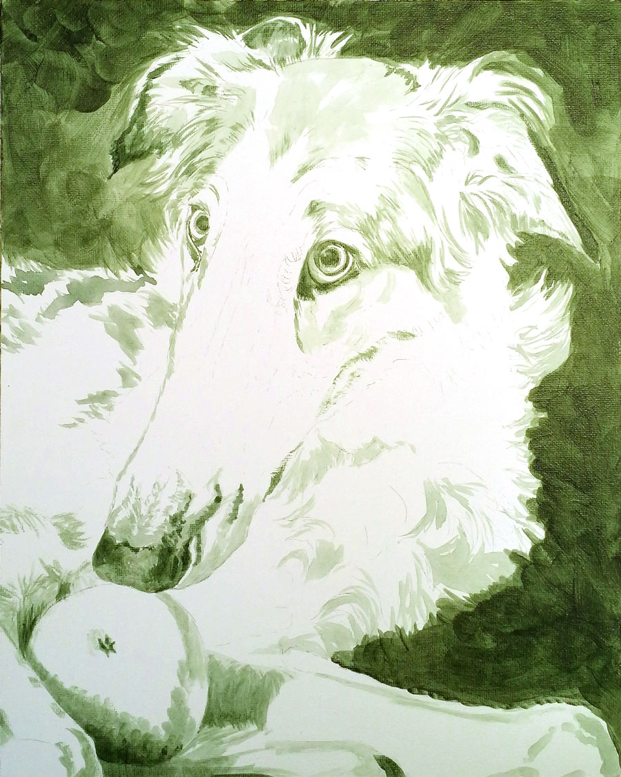
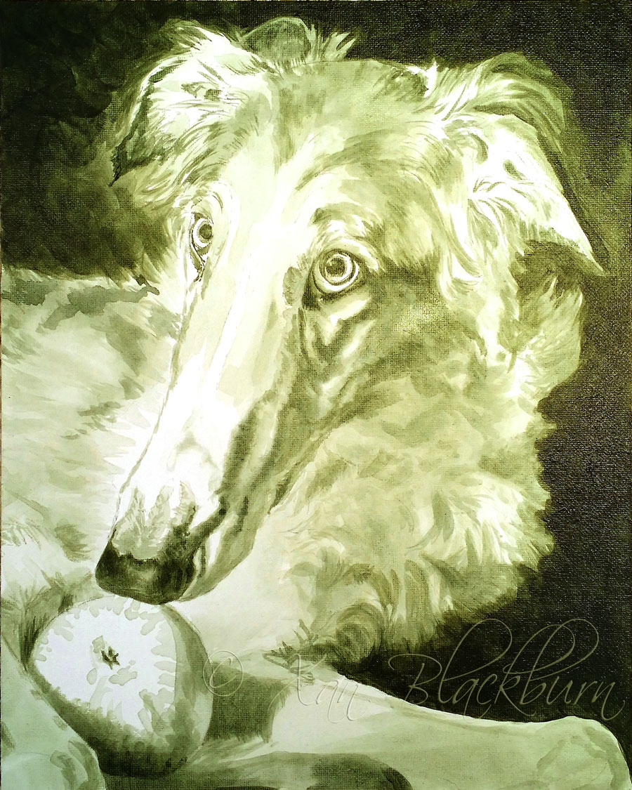
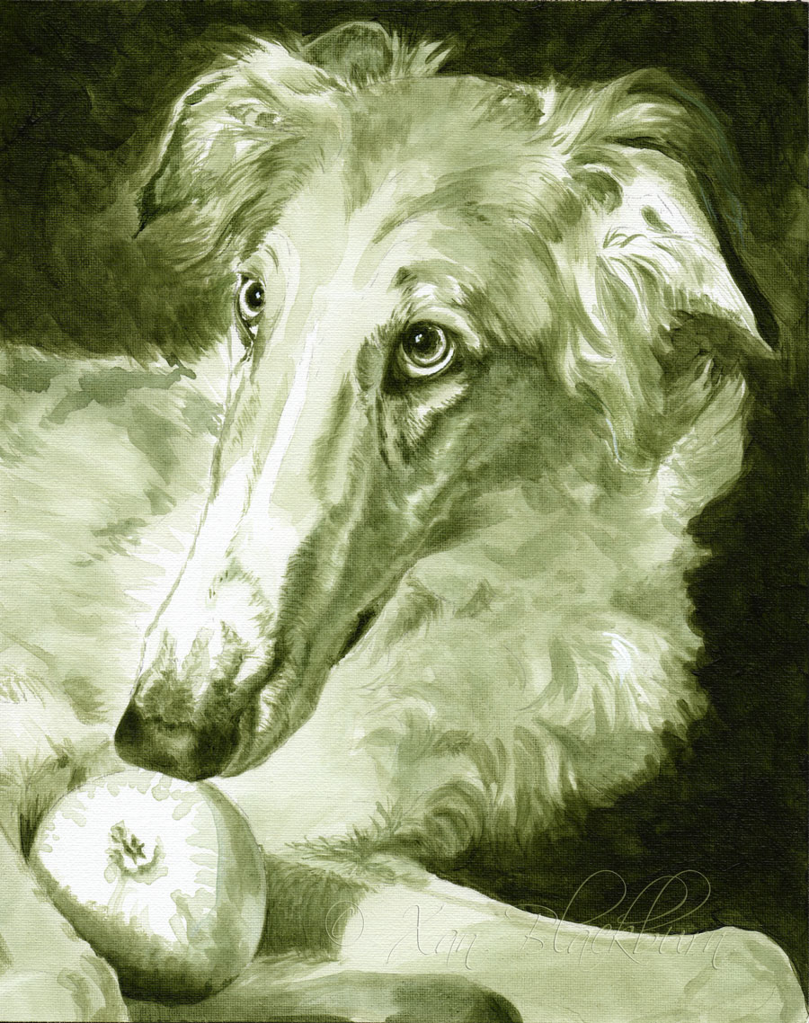
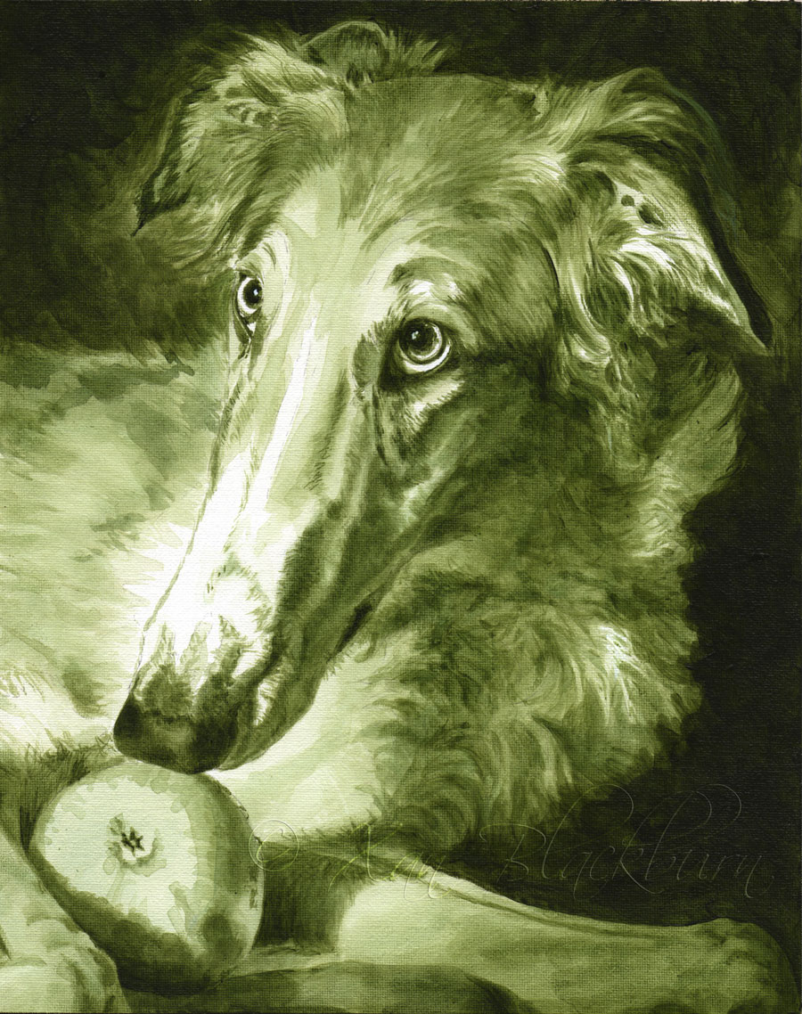
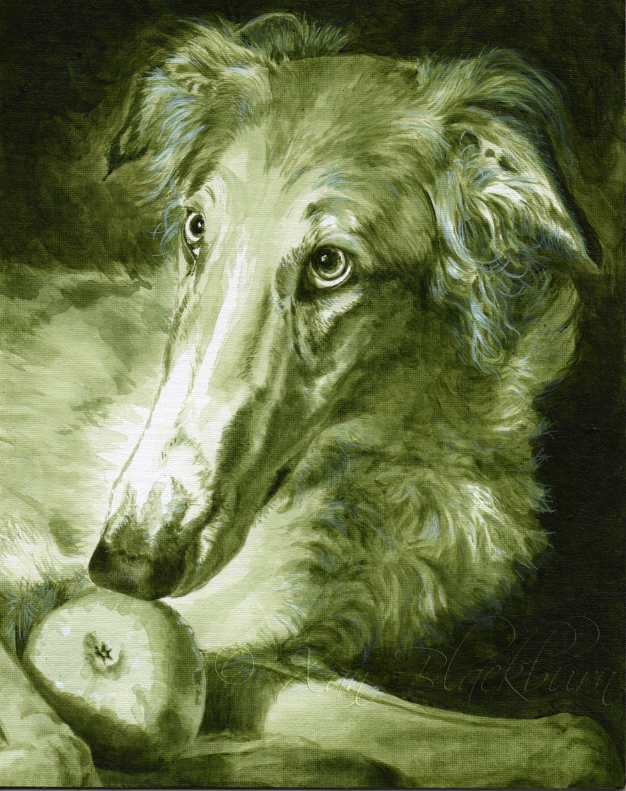
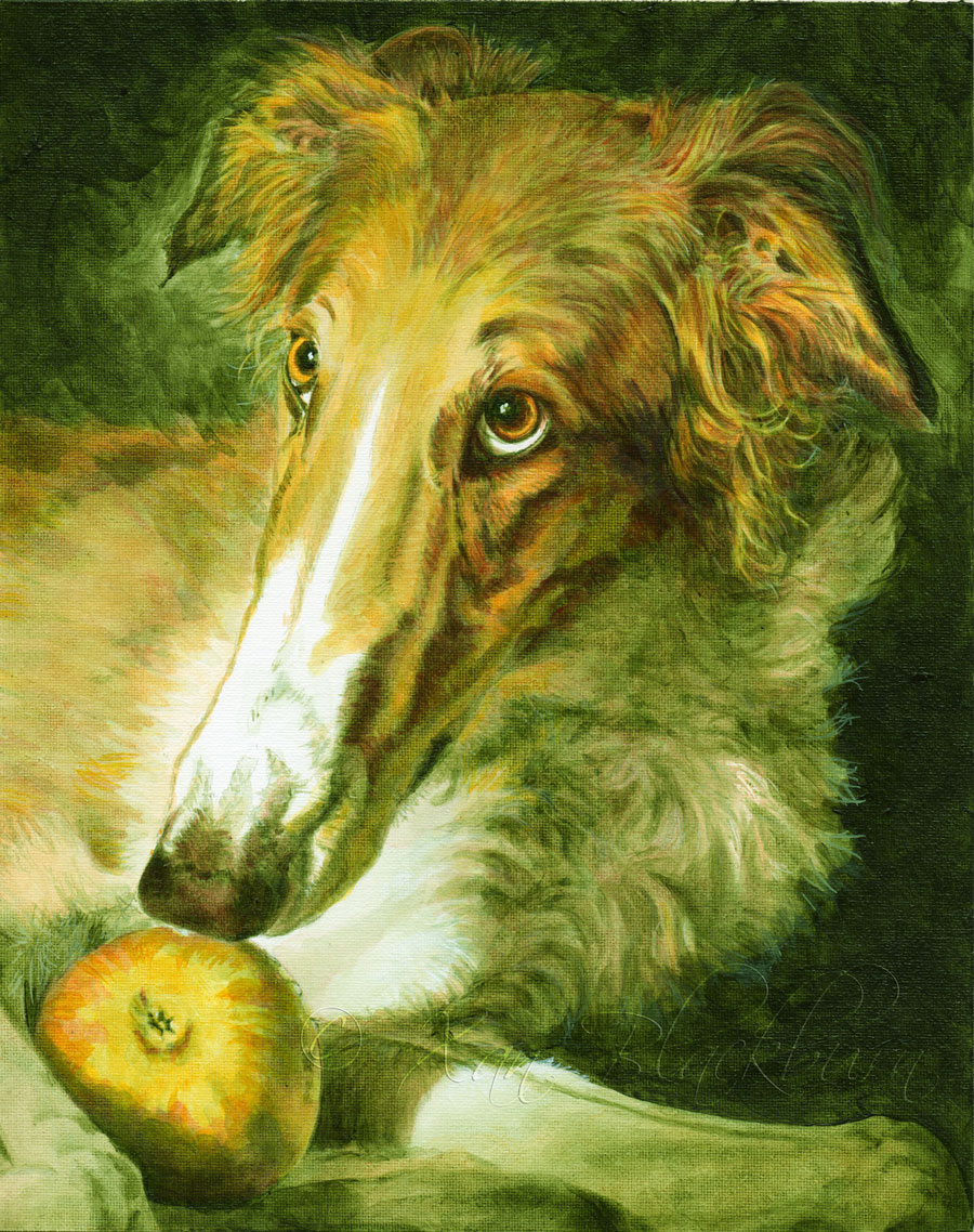
I talked a bit about my approach, choosing an Old Master’s technique of using a green underpainting, in my last post. When using an underpainting, it’s absolutely vital to get it in really good shape, almost a complete painting itself, before moving on. The glazes on top will mostly be translucent, and will be like skin over the underpainting-skeleton. If the underpainting is wrong, it will be very hard to fix in the glazing stage. So, a lot of work goes into that phase, as you can see from the several stages you see here.
I used a Hooker’s Green (stop snickering!) mixed with some burnt umber to mellow the green a bit, for the underpainting. Mixing with glazing liquid (well, it’s GAC-100 Multi-purpose Acrylic Polymer, actually) makes it a translucent, so I was able to build up dilute layers to get fine value (light/dark) control. I wanted to get a handle on the dark background, his interesting eyes, and anchor it with his boxy nose, so that the other details could be accurately triangulated from those points, in case my drawing got obscured during the painting.
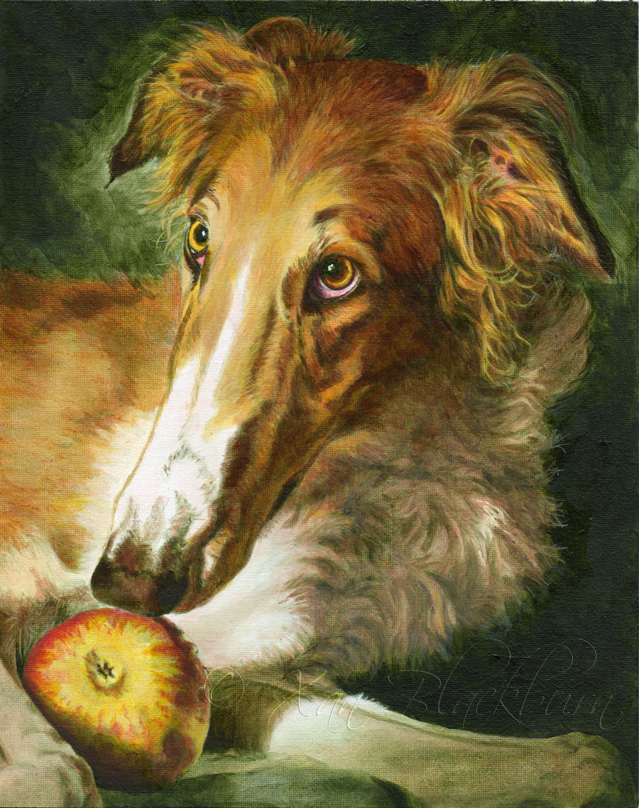
From there, I just continued to layer in details, adjusting values as I went along until I finally felt it was time to hit it with color.
I was pretty nervous about being able to build up enough gold-red tones to tame that forest green underpainting, and, I confess, it wasn’t easy! The golden yellow I thought would give me a good warm base just fed right into the green, making it a sunnier green. Well, duh, I should have figured that. Red is the opposite of green, so it was simply going to take a lot of red to get that green to lay down and behave. I used vermillion, raw sienna, raw umber in the shadows, and Indian Yellow, some cadmium red, but the color that finally pulled it together was Indo Orange Red, which is like the blush on a blood orange. Very poster-paint red-orange, very poppy-like. Yet, that intense color was just the power level I needed to get final control over the green.
The final version you see at the top has a very old-world feel to it. Friends on social media have been reflecting perceptions of old book illustrations, Rembrandt, and classical still-life paintings. That’s pretty cool! I’m thrilled that it turned out so well. The experiments my Muse has been thrusting upon me lately have been both nerve-wracking and pretty fun (at least in the end!) She must be cracking up behind my back, working up new monkey-wrenches to throw into my processes!
Well, her next victim subject is Bo, an English greyhound with a lively story of her own. Onward!
10 Responses
This is a masterpiece! It came together beautifully and so fun to see it take shape. Kudos!
Thanks, Jan! 😀 I’m glad people are enjoying seeing the process on this one. It was a roller coaster for me! 😉
That really looks like a Renaissance piece, but I expected that it would! The original picture was stunning and you only made it more incredible.
The original really was a knock-out. I hope I did it justice! 🙂
I wanted to say that I think Bo’s painting is coming along beautifully! Just so you know, I keep getting an error message when I try to go to that individual post. I can see it on the main blog page, but I can’t go into that one directly, nor will it load from my reader.
Oh! Hm. Well, thanks for the feedback on the technical issues. I’ll see if I can get that sorted. Thanks for the kind words about Bo’s painting! 😀
Hopefully it’s fixed now! Again, thanks for the heads-up! 😀
Wow, it’s gorgeous!
Thanks, Robin! 😀
#PearFleurGiveaway